Taking inspiration from successful rebrands within Irish companies.
A logo is more than a graphic symbol that represents a company name; a logo anchors the story of a brand and should visually convey a meaning about the company or its industry. Every few years, several significant brands spend copious amounts of time and funds on redesigning their logos and branding. Clients might ask themselves, why risk losing the brand recognition you’ve worked so hard to build and develop? Design trends change. Social environments change. This can alter the public opinions of your logo. What was once modern and compelling can lose its power over time.
Our graphic designers within IMS Marketing are constantly looking to companies who are seen evolving with the times and who are listening to the currency of society around them. These are usually the brands that are profiting from the time and effort put into their marketing. Looking at a couple of current Irish companies who are exceeding the limits in utilising the power of the rebrand, we can shed some insight on the benefits of acting upon a fresh look and story to tell.
eir
WHY?
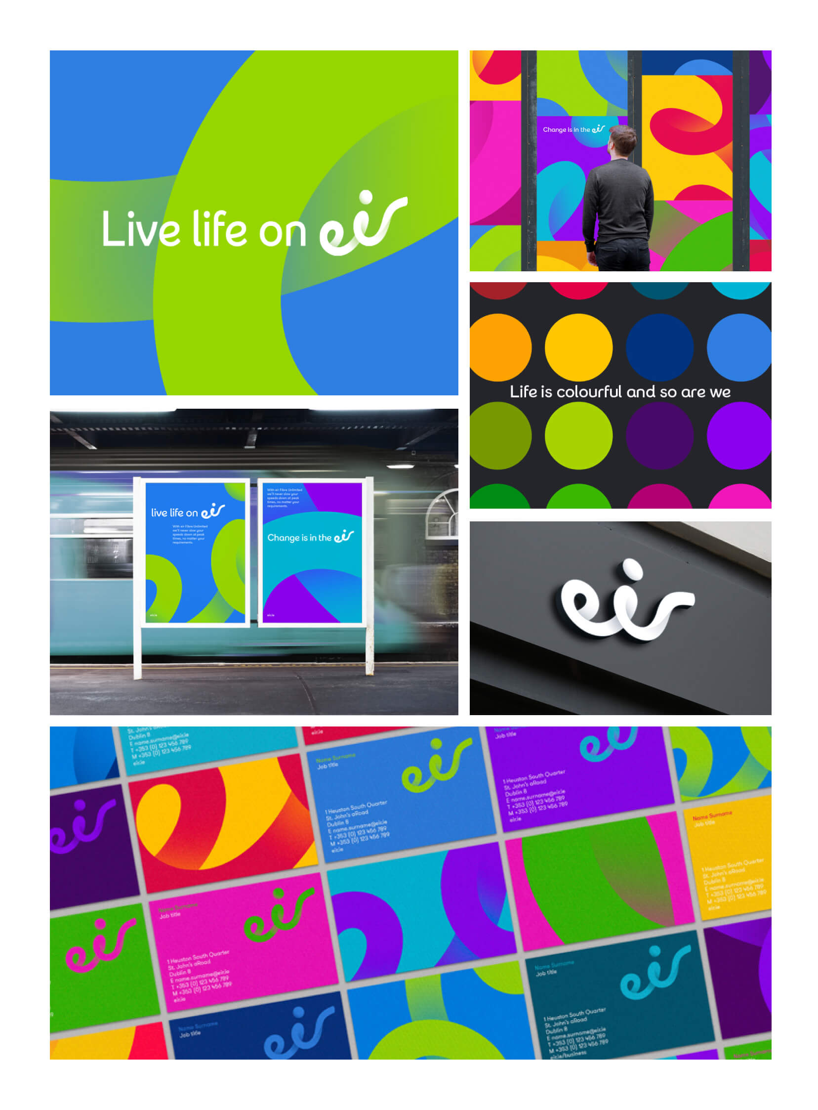
The company that evolved from the Department of Posts and Telegraphs to Telecom Éireann to Eircom is now known as eir. Eir’s investment in its rebrand marks the largest brand transformation within Ireland in over 20 years costing in the region of 16 million euro. The telecommunications company wanted to clarify and streamline their business architecture, transform its brand identity, and to set the direction for over 100 agencies in the launch of its updated look. With strong competition moving into its space, coupled with a public perception tied to less progressive times, the business needed to better communicate its guarantee and role within the changing face of Ireland. The time was right to signal a change – for the business, and for the country.
HOW?
“The new eir identity is dynamic and modern. It reflects our real ambition to become just that, a dynamic and progressive Irish organisation providing the high quality infrastructure and services the country needs and deserves. This is the logical next stage in our evolution as we establish an identity that better reflects the company that we are today.”
– Richard Moat, eir, CEO
Here are a few reasons how a rebranded Eircom is now worth somewhere in the region of €3.3bn:
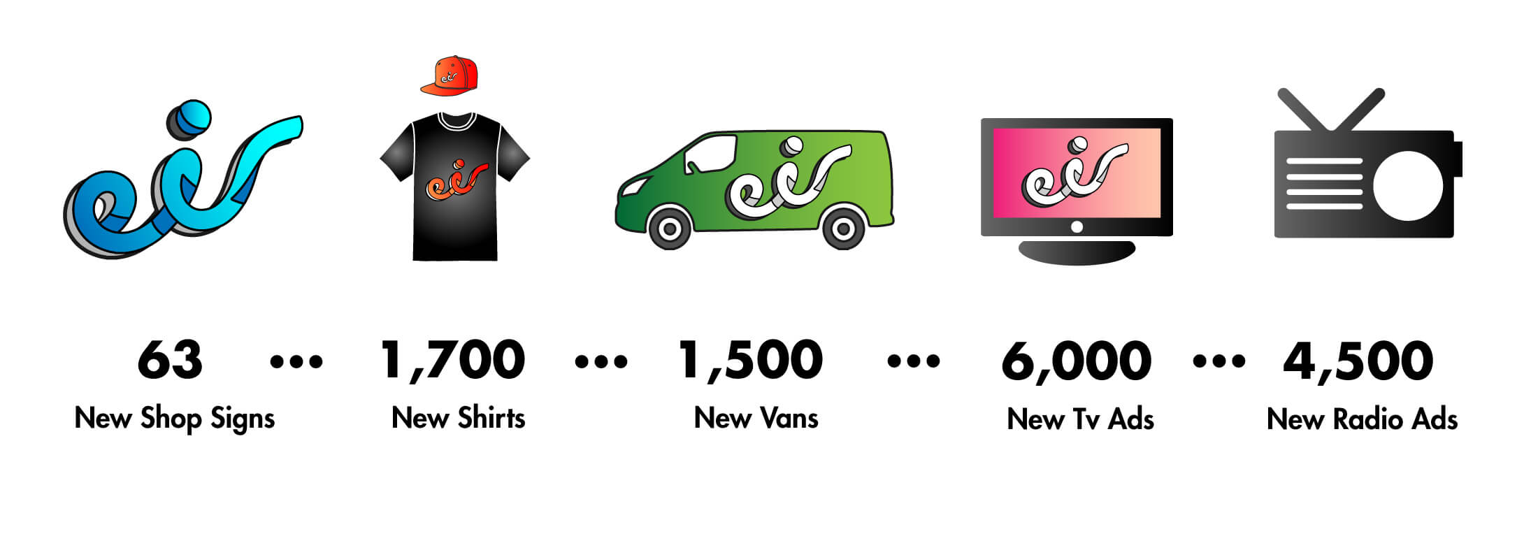
Extensive Branded Material
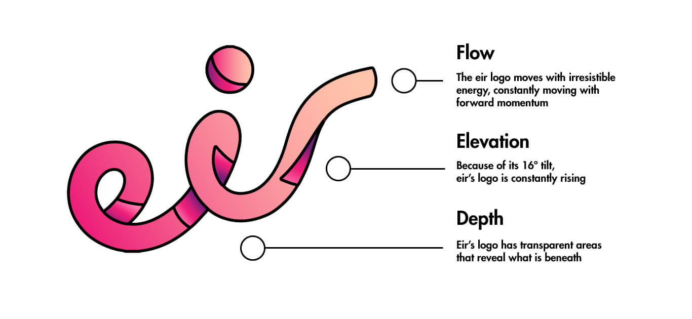
A Strong Logo Concept
Responsive Design Across All Platforms
Even though initially it may look as if Eircom has just lost its com, eir’s new and beautifully designed logo has shown a brave and ambitious commitment as a successful rebrand and reflects a confident symbol that galvanises the ongoing evolution of the business while also strengthening future competitive potential.
AIB
WHY?
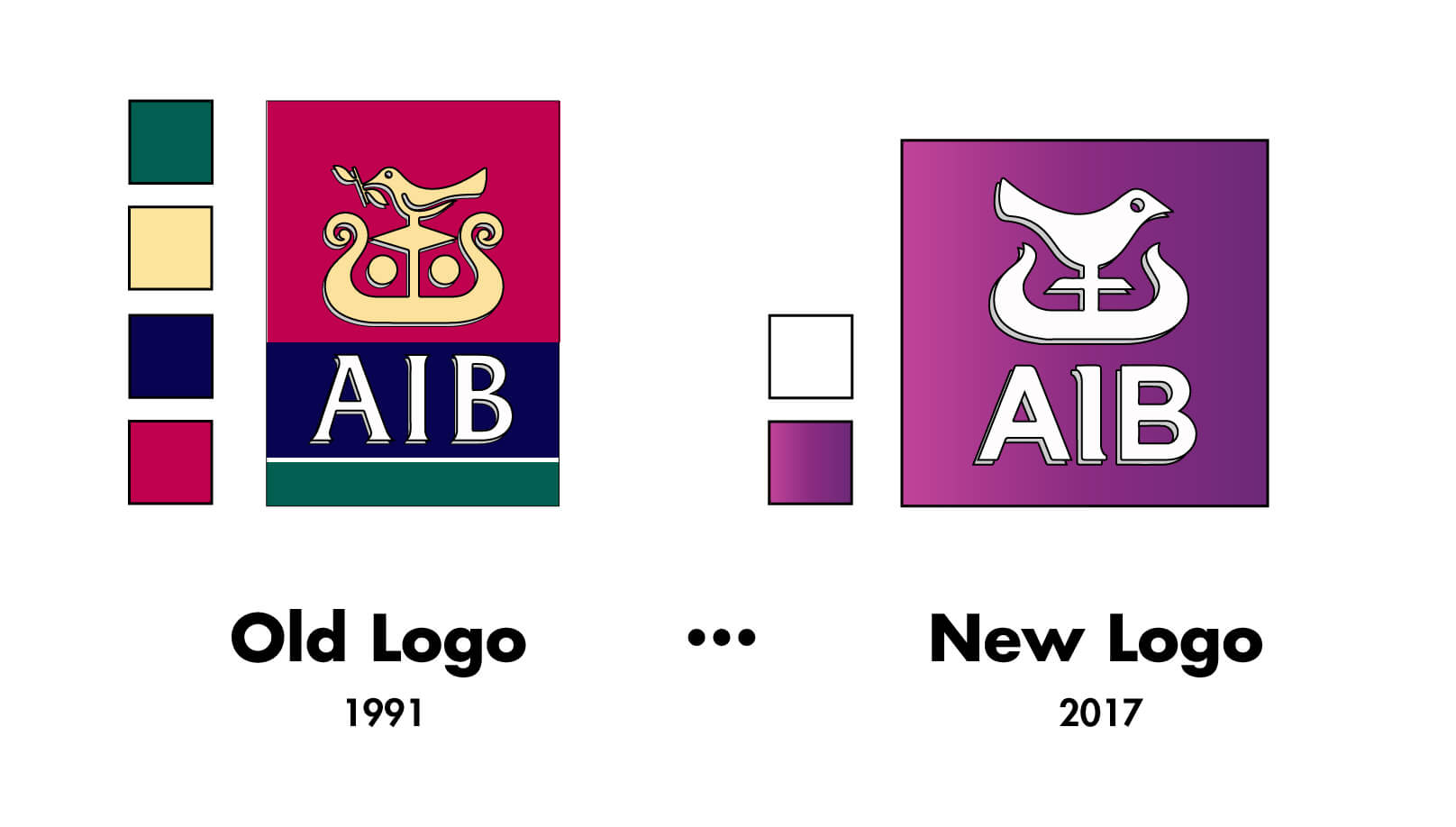
AIB stands out as the fastest growing brand in Ireland this year, up 81% from €761 million in 2016 to €1.4 billon in 2017. Confident of its maintainable profitability, the bank is preparing for an IPO as well as a dividend payout of €250 million to ordinary shareholders; the first Irish bank to do so since 2008. It is unusual for an Irish bank to undertake such a substantial rebranding task as AIB have done. Banks are known to be strongholds of traditionalism and are very conscious about changing their symbolic identity so credit should be due to AIB who have brought their branding into the 21st Century. The last update of the company’s logo was 26 years ago and AIB have stated that they opted for a simplified logo which has been designed to ensure more effective use on digital channels as a large proportion of customers were now shifting towards these means.
Creating a Modern, Approachable Logo
HOW?
AIB’s old logo was originally inspired by a High Cross, a vertical design that did not lend itself well to digital formats such as mobile and web. It had begun to appear as old fashioned and really struggled in clarity when reduced to a small scale due to its low contrasting internal colouring. The creative solution to this problem was to choose a colour that was welcoming, sociable and attainable. The colour purple embodies the balance of red’s stimulation and blue’s calm, uplifting a viewer while encouraging creativity. The graded, angled shadows and direction of the brand symbol seems to evoke a bright and positive future.
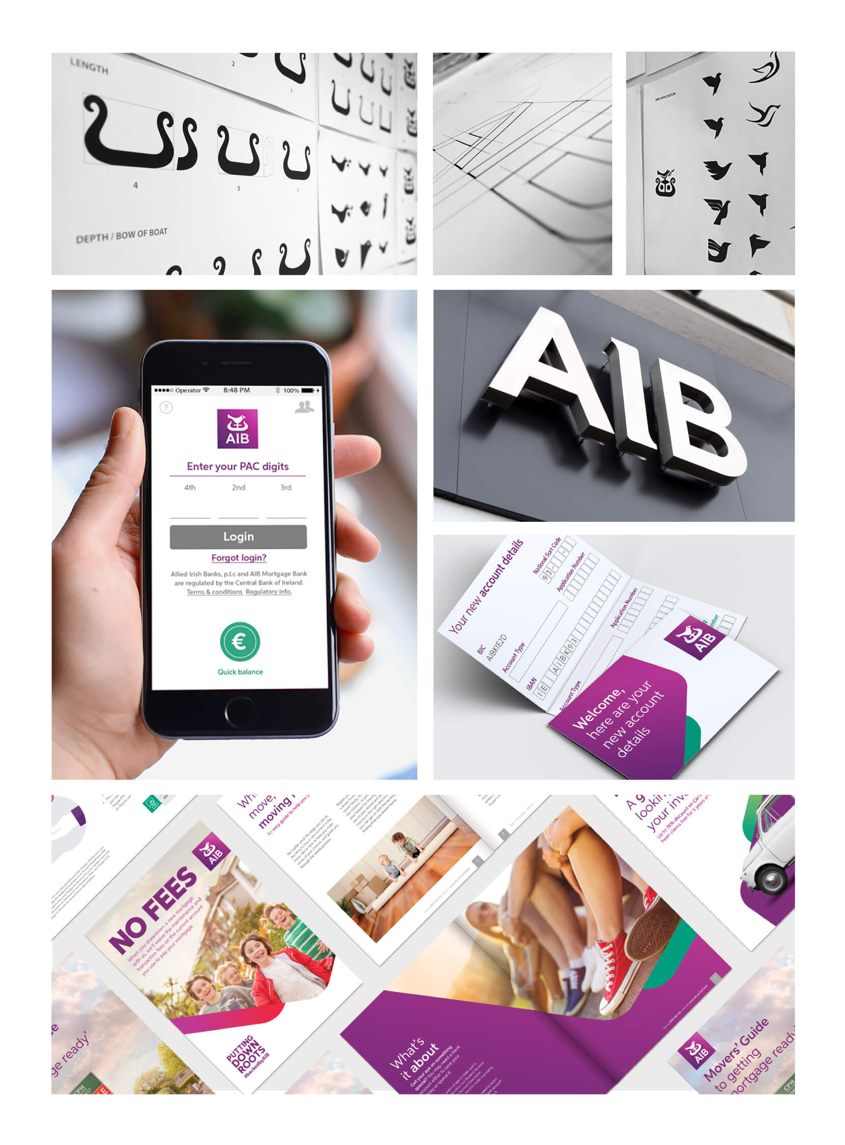
There is no doubt that a lot of effort has been put into the rebrand of AIB, releasing a plethora of newly branded assets such as ATM screens, websites, Tv ads, bank cards, stationary, signage, social media platforms and other printed materials but there are a couple of key things that seem to have been abandoned in its new symbol.
Overlooking AIB’s Brand Ethos
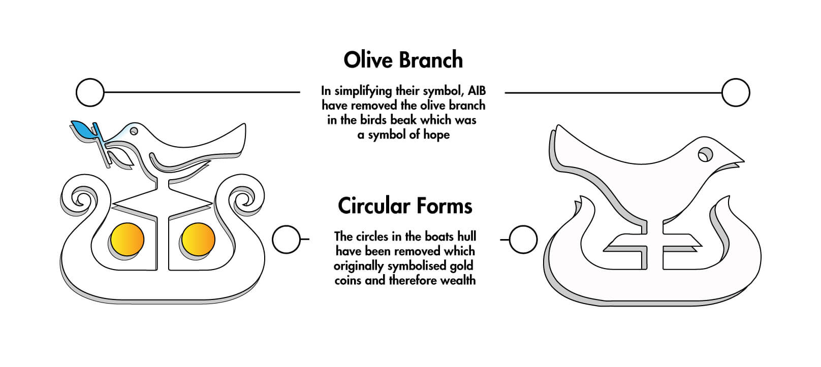
It seems that in the process of simplifying their logo, AIB have lost two symbolic values of what a bank should provide to its customers: Hope and wealth. It does not particularly take anything away from a visual point of view but it is important to note as a client who is considering a rebrand. A company shouldn’t forget its purpose of business and commitment. A strong concept is what should come foremost when designing a branded identity along with careful consideration with design elements.
Taking these examples of successful and ambitious Irish rebrands can hopefully inspire companies who are considering updating their own brand while also giving other designers a platform on how to achieve in creating a prosperous and intelligent portfolio. If your company is growing and evolving and you feel as if your logo is starting to look outdated, take the bold but rewarding opportunity in giving your brand a new and current look.
If you are interested in rebranding or have any questions surrounding this topic, please contact us on 091 739450.

