For a business selling a physical product, they often spend most of their time focusing on the product itself, the channels they will sell through, the overall marketing strategy and how best to communicate the product to their target market. Packaging is often seen as a small detail in the grand scheme of things.
However, packaging is far more than a storage facility for your product. Your product may be the best in your industry, but without an attractive package customers may not even give it a second look. The term ‘don’t judge a book by its cover’ unfortunately does not apply in the consumer decision making process. First impressions are vital!
Your packaging has the ability to grab their attention, to give them key information about your product and to ultimately choose you over a competitors offering. Sure, the strength of the product is what will encourage repeat purchase, but packaging can very often lead to the initial purchase and the chance to turn a potential lead into a loyal consumer.
So, in a world of information, where consumers are faced with so much choice both on the shelf and online how do you make your product stand out.
Here are a few tips to consider
Who is your consumer?
By now you will know your target market. You will have identified their gender, their age range, their income, their character. Knowing the details of your consumer and their lifestyle will help you design the packaging that has the best hope of grabbing their attention. This doesn’t automatically mean that you need to have loud colours that jump off shelf. If your consumer is more likely to want a lot of information displayed on the product, this is your chance to display as many of the key benefits as you can fit to further re-assure them that you are the right choice. Again, knowing your consumer is key to the route you take
What is your budget?
Very often, packaging is the final consideration when analysing your cost of goods. In an ideal world you would have the highest quality packaging spec with an open cheque book when flicking through the pantones you may want. However, before the marketing team get carried away, the discussion needs to be had about how much the business can really afford to spend without drastically affecting the profit margin. The initial decision may be to spend slightly less for launch, choosing CMYK only instead of adding additional pantones, maybe going with a lower quality spec board if your packaging is card based. Once you have an idea of potential profits post year 1 you can look at tweaking the design and quality. However, we would advise for launch to invest what you can afford to give your product the best possible chance on shelf.
What are your competitors doing?
Analyse your competitors. This doesn’t mean just browsing online or instore. Buy their products, put them on your board room table, analyse all aspects of the design, from colour to functionality, to level of information on pack. Are there specific areas of the design that are common among all? Are there elements you need to include for the category you are in? Once you have completed this research start to ponder…What can you do differently?
So, you now know your consumer and your internal teams have got the arguments over budget for packaging out of the way, you’ve reviewed the competition and are ready to begin your design.
How do you now focus on grabbing your customers attention? Shelves in store and online are swamped with products. Consumers will be drawn to what gets their attention. Even if they have arrived looking for a competitors offering, if your packaging appeals to them more there’s a good chance they will at worst pick it up or view it online, at best trial it!
To help you stand out from the crowd, think of the following:
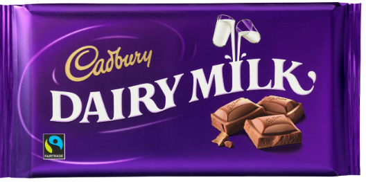
 A unique colour– it may seem simple but something as simple as a colour can make you stand out. Review your competitors, your consumers and your product. What colour scheme will differentiate you? Coca cola didn’t always ‘own’ their shade of red in the soft drink market. Now however, no other company would dare try and follow it. Cadbury is another example. The purple pantone 2685C is synonymous with Cadbury and they in fact won a court case in 2012 to guarantee them exclusive rights to this colour in their category.
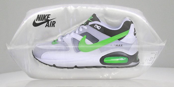
- A unique packaging shape– colour may be your first thought, however differentiation through packaging shape can also grab your consumers attention. Take the packaging Nike used for delivery of their online sales for a range of Nike Air Max as an example.
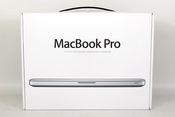
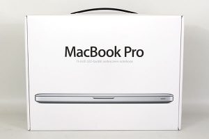 Sometimes, less is more- it may seem like a strange idea not to fit as much branding and product information on your packaging as possible but sometimes less can really be more. There are the high-profile examples we all know such as Apple who focus on a minimalist design on their packaging. Sir Jonathan Ive, Apple’s Chief Design Officer, points out, “Simplicity is not the absence of clutter, that’s a consequence of simplicity. Simplicity is somehow essentially describing the purpose and place of an object and product. The absence of clutter is just a clutter-free product. That’s not simple.”
Minimalist packaging designs can help cut away the ‘noise’ from on shelf and help your product truly stand out. It can also help boost profits by cutting away on waste. A further benefit could be that some consumers actively search for companies who they deem to be environmentally friendly and your packaging can emphasise this message.
Remember your packaging is part of your overall brand communication strategy. Your packaging needs to be an extension of your brand message. So, keep that in mind, the last thing you want is a confused consumer…Consistency is key!